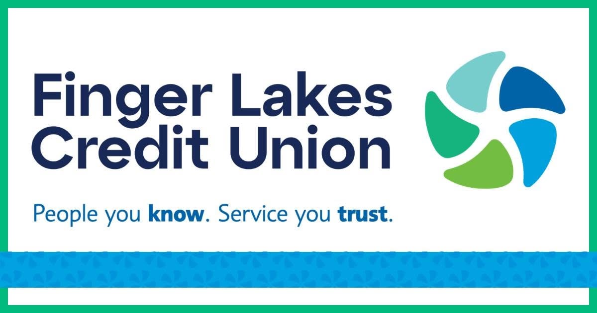
Finger Lakes Federal Credit Union has announced a new brand identity that includes a shortened marketing name, updated logo, and a refreshed visual design.
From now on, the institution will market itself as Finger Lakes Credit Union, dropping “Federal” from its public-facing name. The rebranding also includes a new logo, updated fonts, and new brand colors.
Credit union officials said the new look reflects the organization’s growth and expanded services while maintaining the mission and values it has upheld since its founding in 1967.
The refreshed brand was introduced to members in late June and is now being rolled out across the credit union’s website, social media platforms and other marketing materials.
President and CEO Bob McFadden said the updated brand reflects nearly six decades of growth alongside the communities the credit union serves while reaffirming its commitment to members.
Officials emphasized that the rebranding does not affect the credit union’s operations or members’ accounts. The institution remains federally chartered, deposits continue to be insured by the National Credit Union Administration, and there are no changes to its regulatory status, staff or services.
The updated branding will continue to appear at branch locations, on digital platforms and in marketing materials through the remainder of 2026 and into 2027.
Founded in 1967, Finger Lakes Credit Union is a member-owned, not-for-profit financial institution serving more than 22,000 members. The credit union has approximately $250 million in assets and operates branches in Geneva, Phelps, Fairport and Webster.